
Actionable analytics
It's not about slick graphs and single-screen snapshots of KPIs

Most demos of software products include an analytics component. The salesperson doing the demo opens a fancy dashboard and wows the prospect with pretty visualizations with a responsive and modern design, fancy filters, and powerful drill-down capabilities.
The audience watching the demo gets excited with all the bells and whistles, and forgets to ask the critical question: How actionable will this be for us?
Fast forward a few months, and the user adoption rate of the dashboard remains terribly low. (I should know; this happened for me more than once in my career as a product manager).

The main reasons dashboards are everywhere these days is that tools to plot data with controls to slice and dice it are now a commodity, and graphs that look cool can help sell a subscription to a SaaS product. But the value that can be extracted from dashboards tends to be vastly overestimated by the buyers.
Telling the right story with data
The reason so many dashboards included as ad-ons in software products have low user adoption rate is simple: often they are not the right tool for the job at hand.
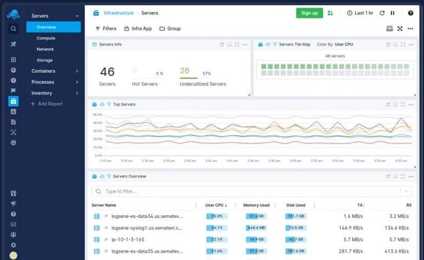
Imagine that you are running a large e-commerce website. Any issues preventing customers from completing checkout can represent millions in lost revenue for the company. Initially, if you’re going from zero in data visualization to a dashboard like the one below that offers infrastructure and application performance monitoring, you may feel like you have good reasons to celebrate.
But consider someone opening this dashboard every morning and poking around to see if there is anything that needs attention. Besides the inconvenience to have to look everywhere for potential problems, by the time an issue is big enough to be easily detected to the naked eye, the damage to the business may already be substantial.

Many companies approach every data problem with the same dashboard solution
Depending on the kinds of decisions and actions the data is meant to support, a dashboard may not be the best medium to communicate insights. For example:
An executive who wants to trigger big moves before their competitors may benefit more from a static report that combines internal and external data to highlight early-stage trends than a dashboard that only displays internal KPIs.
A cloud manager who wants to keep cloud costs under control may achieve better results sending monthly or weekly chargeback reports to each business unit with an unusual consumption of cloud resources than using a fancy dashboard that displays consumption over time without context to interpret any variation. (With a chargeback report, the marketing team may confirm that a spike in cost is explained by a one-time transfer of data from one CRM to another, while the QA team may find out out that they forgot to turn off an expensive resource after completing a test.)
An e-commerce manager who wants to react quickly if an issue is detected with checkout may need a notification system for when a change beyond normal variation is detected so they don’t keep chasing noise looking at a dashboard. Once a problem is confirmed, then a troubleshooter may want to check some charts and use drill down functionality to get to the potential causes of the problem.
The core question answered by a good analytics tool
Instead of just producing plots built on a set of priorities and assumptions about what’s important that people have to interpret on their own, a good data analytics tool answers the question, What’s the story?
Datadog, a company that offers app monitoring tools, illustrates how to make data actionable by telling the story behind a detected anomaly.
When monitoring a web application, identified issues are displayed in a screen like the one below, not only indicates that there is an ongoing problem, but helping isolate the problem by displaying the indicator that triggered the “story”. Valuable contextual information accompanies the chart: “Error rate has been up for about 13 hours”. With this curated display of information, the user can quickly see how the latency and error rate have substantially increased while the total number of requests remained stable.

The original blog post further illustrates how this kind of system can go further and automatically surface related issues and pull in log events that narrow down the exact cause of the problem. Its big value is not the delivery of fancy visuals, advanced filters, or different choices of chart types. Rather, the real value resides in the ability to quickly go from “we have a problem” to “we know how significant the issue is, which services are being impacted, and which pieces of code are likely causing it”.
When a few words are worth more than a thousand plots
Giving decision-makers the story in human language can dramatically increase “decision yield” compared to asking people to use a dashboard.
A manufacturing company started leveraging machine learning and natural language processing to display messages like this for the plant manager:
NEGATIVE PERFORMANCE CHANGES

On-time delivery dropped from 90% to 85% this week, with no cause for alarm. This result can be attributed to a recent grow in the workforce that increased the percentage of employees in training, a temporary situation.

IMPROVEMENTS AND OTHER HIGHLIGHTS

Machine utilization is up from 70% to 85% (now at the desired level).

Internal product quality metrics (rejects and rework) remain at acceptable levels and continue to trend down.
Sure, adding a graph or two showing trends might be nice add-ons, but when all the hard work is being done in the background by the analytics tool, there is no reason for a manager or analyst to regularly spend time asking questions and looking for insights in a dashboard with predefined tiles. When an issue requires action or investigation, the system can surface the appropriate charts. For example, if an unusual increase in defect rates is detected, the system will display a defect chart with the ability to drill down into defects by reason or by department, a level of nuance and context that wouldn’t be found in the default measurements provided by the dashboard the new system replaced.
You can’t go wrong by focusing on the story
Extracting timely, actionable insights from data can be challenging, but smart companies don’t let the obstacles deter them.
Unlike the organizations that rely on dashboards that never change what deserves “front-page attention”, those companies invest on autonomous analytics, a process that allows machines to sift through vast amounts of data and surface only what decision-makers need to know.
Sure, if a team is only concerned with some specific KPIs such as error and latency of an e-commerce website, then a dashboard that focus on those metrics and supports related alerts and notifications may be a good choice.
But for decision-makers interested in responding appropriately to threats and opportunities, the best tool is the one that combs through all the data and navigates through a complex variable space to expose the story of the day.
Contrary to what many vendors say, the best analytics tools are not the ones that present official-looking views into KPIs and let users ask questions and perform limitless data exploration. The best tools to drive action are the rare ones that deliver key insights through narration and visualization that answer a single question: What’s the story?