

Modern data visualization tools, now powered by AI, promise to help users at any skill level do a better job of analyzing, comprehending, and presenting data.

However, despite today’s almost limitless options for visually interacting with tables on the fly, the problem of turning data into information that actually changes the way people think hasn’t been solved by data visualization software.
If your aim is to inform, change people’s minds (as opposed to dumb things down, make things faster and more average), there is no way around applying effort and workmanship in the service of this goal.
Knowing the basics of data visualization, including which charts tend to be best suited to convey different types of information, while useful, is hardly sufficient to produce actionable information.
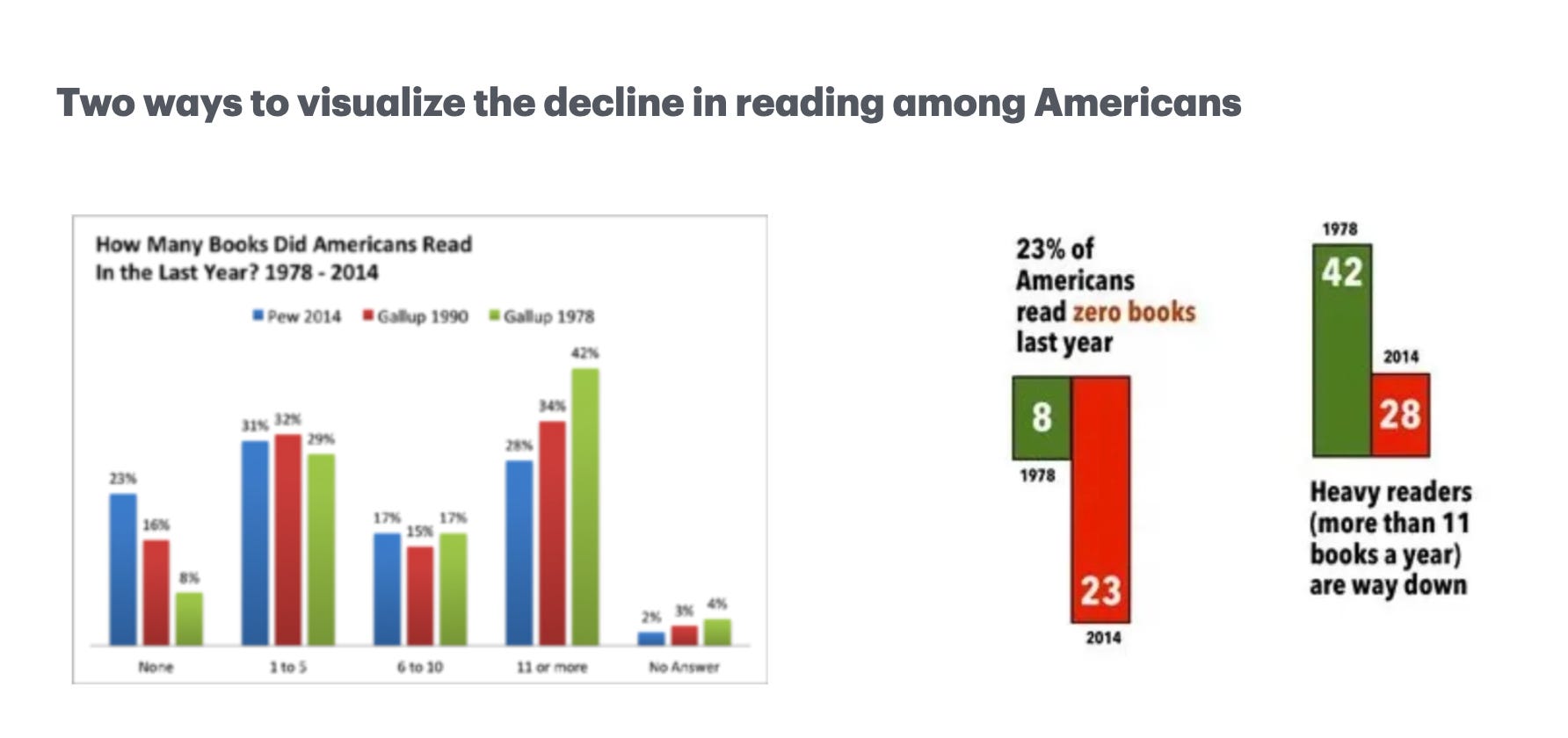
Consider this example from Seth Godin. Both visualizations use bar charts to show the decline in reading among Americans during a period of time, but the one on the right is a thousand times more effective to describe what’s happening.
Questions to be answered before you start creating any chart
Whether you’re a statistician that believes that everything could be a bar chart, or a designer who takes pride in building stunning visuals, nothing will define your visualization’s resulting value more than answers to the following questions.
1) Why do we think we need data viz here?
It’s true that clear and engaging visualizations are often the most effective way to make complex data more accessible and understandable. When we’re trying to comprehend relationships, trends, or patterns contained within a complex data set, our brains tend to process pictures much more easily than rows and columns of data.
Still, when we need to communicate information, it’s always wise to ask first why we might want to do a visualization. Some people are so eager to jump into building a graphical representation that they skip the step of understanding whether they truly need data viz to communicate their data insights effectively.
2) Who is this visualization for?
Are you trying to convey information to executives with an urgent need to make a decision? Change public perception about a social issue? Entice casual browsers looking for entertainment?
The best starting point for good data visualization is clarity about who is it for. Decisions based on assumptions about who the viewers are and how they interpret information are not going to yield a high-impact visualization.

3) What change do we seek to make with this information?
Is the intent merely to get people to recognize your good taste, sign up, 'like', share? Turn data into actionable truth? Change someone’s mind about an important issue?
Clarity about the change you want to make helps establish the context for your visuals and produce specificity in terms of what to emphasize in the data: trends or relationships, differences or similarities, exact numbers or big picture.
4) What constraints do we need to design around?
Will your visuals be part of an in-person presentation in which you’ll be able to click on various parts of a chart to drill into different views of your data on the fly? Or will they be part of a report offering a static snapshot requiring things like explanatory text, annotations, and footnotes to be understood without help?
Will your audience have the opportunity to interact directly with the underlying data to build their own charts? If so, are they sophisticated consumers of visual analytics, or unfamiliar with the tool?
The constraints you’re facing should be used as an asset, an opportunity to ensure that your charts become a powerful narrative device for presenting information to its intended audience.
Nowadays there is no shortage of tools and libraries to generate plots in one click.
The hard part is choosing, among near infinite possibilities, the subset of graphical and pictorial representations that will deliver on expectations.
And just because ChatGPT can build you a chart that is full of bells and whistles and looks pretty, it doesn’t mean that it can do the work that needs to be done to communicate data insights effectively.
Specificity in terms of why, who and what is the key to using data viz to make people see something they weren’t expecting and compel them to act on it. While design matters, it’s easy to fall into the trap of thinking that beautiful visuals matter more than they do.
Between a fanciful graph that causes your audience to walk away wondering what they were supposed to get out of it, and a simple chart that produces an incredible “a-ha moment,” which one would you choose?

As Seth Godin says,
The purpose of a graph is to get someone to say "a-ha" and to see something the way you do.
Begin there and work backwards.